A few days ago, BleacherReport.com put out their rankings of (what they thought were) the top home unis in the NBA. Well, I read the list, and, well, I disagreed with pretty much all of it. I'm not saying the person who wrote the list (Mr. Felkey, I'm lookin' at you, kid) has little clue of what he's talking about. I'm just sayin'.
So, I tried my hand at my own list. What I did was pretty frickin' awesome, if I may toot my own vuvuzela for a moment. I paired up each team against each other team, so as to have a complete 29-game round-robin schedule. No RPI and SOS discussions will ruin this masterpiece. What I came up with was quite different from Mr. Felkey's list. And, to be 100% honest and biased, it's a much more scientifically accurate ranking. It just is. I'm a uni guy - I know these things.
Before I begin, I will point out that I moved the Lakers and the Knicks from the 2nd and 15th spots, respectively, to where they are now after the round-robin (scroll down to find out, bucko). I just couldn't keep the Lakers up that high, as the longer I stared at their home unis (the yellow ones, not the actually more impressive white ones) the more I longed for the old-school versions. Also, the Knicks would have fared better with a better collar and the black-less uniforms from years past. But they still have uniforms worthy of the upper echelon in the NBA.
Also, I do have a weak stomach for piping and side panel messes. And I have an affinity for blue. Let's take those Rockets, for instance....enjoy....
30. Houston
When these came out, I was immediately turned off by the frailness of the design. It is a cool logo, but the sides of the jersey make it look like a blouse and there simply is no boldness to it. Had these been blue, they may have gotten a win or two in my round robin.
29. Washington
Take some Bullets and shoot these things, Gilbert. See what I did there?
28. Minnesota
Too much piping and cuteness here. I long for the original Wolves uniforms. The font kills it. Absolutely kills it.
27. Atlanta
Don't get me started on the Hawks' color scheme. Why are they red and blue??? The 3D lettering and piping is disgusting. Bring me back some Human Highlight Film uniforms!
26. Sacramento
They got too cute with this new uniform. It's generic and not so much fun to look at. Not a fan of the off-centered numerals on the front.
25. Utah
Can't wait for the new unis to come out. These are much better than the final years of Stockton and Malone, but they're not too much fun. Piping!!!
24. Milwaukee
What the Buck?!! I used to live in Milwaukee, so I can say that. The green and red are solid, but too shiny. The lettering needs to even out. I hate the big first and last letters. They're corny as hell, which is more appropriate for an Iowa or Nebraska team. Go back to the Moncrief days, please!
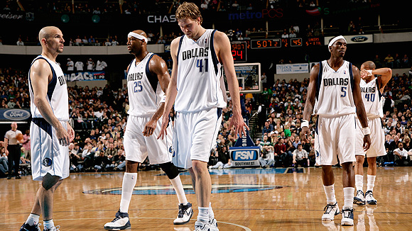
23. Dallas
Slightly better than their close relatives from Sac-town, probably cuz of the blue in there.
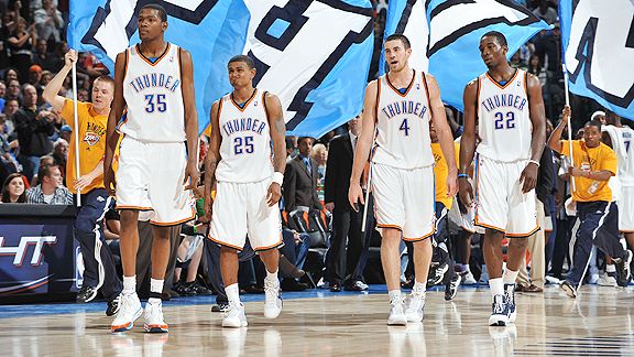
22. Oklahoma City
Big fan of the plain, old school style, but there's gotta be more to a uniform than this. The entire branding of this team baffles me. Still waiting for the overhaul. Will there be one soon?
21. Phoenix
Sides are too thick. And that floating circle irritates me more and more. Why not just get rid of it? That would be an instant hike 5 spots in these rankings.
20. Detroit
Might be the first big surprise of these rankings. The Pistons had sweeter unis in the 80s, and for some reason they think they've improved on those. The font is bland and weak. It's really a blah uniform.
19. Toronto
It's a sleek design, but it's missing something. Perhaps history, I don't know. I do know the color scheme isn't helping.
18. New Jersey Nets
They could stand to get new jerseys. Get it? I'm on fire, really. "NETS" is too big, but the color scheme gets them to this level of mediocrity from that of the Kings and Mavs.
17. Denver
Felkey loves these. I say the shine is their demise. Powder blue is a great color, but the design is weak. Less would be more in this case. Let the powder blue carry you, is what I always say. Heck, if they went with that shade at home and navy on the road, I'd be in sky blue heaven.
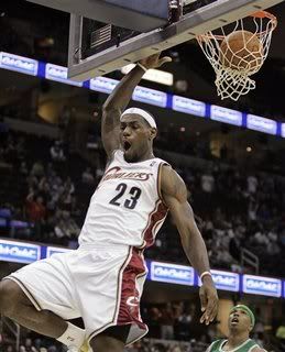
16. Cleveland
Love the template. The wine and gold is played out again. Those "CAVS" alts really should make a comeback. My Decision is final here.
15. Orlando
I like what the Magic have done here, with the bold "Magic" on their chest. The piping and striping still take away from what could be a much better design.
14. Philadelphia 76ers
Oh. So. Close. All the Sixers had to do was completely go back to their 80s design and not continue to tease us. The different colored letters and numbers flat out piss me off. Not to mention whatever weirdness they decided to cloud the sides with. Ugh.
13. Miami
Quite frankly, this is a great design. Bron-Bron will look good in this uniform. It's just missing something to vault it into the top 10. Perhaps it's the color scheme I don't love.
12. Memphis
I immediately think Stanford when I see these. I think this is one of the best color schemes in sports. Also see: L.A. Galaxy. But just as I didn't think Stanford fully grabbed me with their font, so don't these.
11. New Orleans
Number 1? Hardly. If anything, the pinstripes take away from it. "New Orleans" is a pretty busy name to have on your chest as it is. Great colors for a great city that I've never been to. Just a little too busy for my liking.
10. Portland
I'll complain about the upper-case "BLAZERS" all night long. All night. All night long. All night. The font is weak. This could be a top-5.
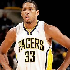
9. Indiana
Reminiscent of the Magic uniforms, but done a little better, in my opinion. You could argue these are underrated. But I won't, cuz it might inspire some schmuck to make his own list.
8. New York Knicks
The black trim kills these unis. Why, why, why? And the collar. What's up with that? Another great uniform gone wrong, but still a top-10 one.
7. Los Angeles Lakers
Great uniforms. Crisp. Bright. Nice cut. I like how they updated them, but the numbers get to me. And as mentioned above, I prefer the white ones. Those are really neat-o.
6. San Antonio Spurs
This is a classic uniform that hasn't been tarnished for the most part. And you can't even say the addition of black has ruined them. Ha! The color scheme works with this blue-collar team, although not one of my all-time faves. Still, the design is awesome and it's a template I wish more teams would use. Talkin' to you, Houston and Minnesota.
5. Golden State Warriors
Now, I'm going out on a slight limb here (a twig?) to say these unis will mostly resemble "The City" uniform from the past. Judging from the jersey, it looks like they will. And those things are beautiful.
4. Los Angeles Clippers
I'm proud of this team for grinding through years of suckitude to make it to the top 5 of these here rankings. Way to hang in there, fellas. Quite frankly, these are great uniforms. I'd tweak the thick side stripes a little thinner. Do that and these contend for the title. The cursive "Clippers". Need I say more?
3. Charlotte Bobcats
In what could be the most surprising in these rankings, the Bobcats have landed in the top 5. Why? The color scheme is wonderful. The crispness of the uniform on the whole. The pinstripes work for these guys. It's not over the top, while pushing the envelope a little bit. It passes the eye test for me with flying colors.
2. Boston Celtics
A true classic. The Lakers and Sixers could have followed suit 100% and been up here with them. These have stood the test of time. Nuff said.
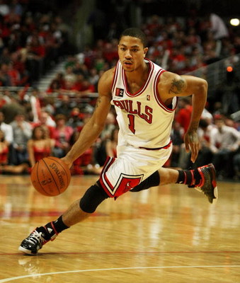
1. Chicago Bulls
What we have here is a work of art. The trim, font, shorts design. It's all here. You simply can't mess these up. Too bad Lebron isn't going to be wearing these. Although an even better player once did. How did that look to you? (Image courtesy of Bleacher Report, ironically enough.)
What are the biggest discrepancies between the two lists, you ask? The Warriors, Pacers, and Sixers jumped up 17, 12, and 10 spots, respectively, in my list. The biggest losers were Dallas (13 spots), Denver (13), Houston (14), and Milwaukee (15). Sorry, guys. Your work is cut out for you.
Comments welcome. Vote in the poll to the right on who has the better list, if you dare! As always, thanks for reading.
Showing posts with label NBA. Show all posts
Showing posts with label NBA. Show all posts
Monday, July 26, 2010








Monday, April 12, 2010
Why does Philly hate Kobe?
Last night I saw a snippet of an E:60 story on why Philly hates Kobe. They were saying it's because he didn't play for the Sixers or because he left the city for Los Angeles. With all due respect, Sonny Hill, I don't believe the glitz and glamor of L.A. has anything to do with it. Here's my take:
First off, Kobe isn't even from Philadelphia. He's from the Main Line, an affluent suburban area due west of the city. Specifically, he went to Lower Merion High School, which lays in a predominantly white neighborhood. Sure it's no prep or Catholic school that may tend to recruit, but it's one of the wealthier public schools you'll see.
On top of that, he lived in Italy for a few years before moving back to the Philadelphia area. The son of Joe "Jellybean" Bryant, a pro basketball player (and former Sixer), one could say Kobe didn't exactly come from the hood. And one would be right. Kobe was a cultured kid, fluent in Italian. Definitely not your typical city kid, let alone suburban one.
So there's that. One might demand, name me a high school star that Philly DOES love. Here are three that Philly definitely has welcomed home with a standing "O" and a warm embrace.
1. Rasheed Wallace
'Sheed went to Simon Gratz, a city school, for one. Sure, he left the area for North Carolina when he graduated and then went on to the NBA and played for a few teams that weren't the Sixers. And, sure, he's currently on the Celtics. Well, Philly doesn't have a problem with 'Sheed. He's a Philly kid. Not much argument here. Do we absolutely drool over this guy when he returns? No. But we do show respect, because he grew up here.
2. Bo Kimble
Bo went out to California with Hank Gathers (R.I.P.) for college. But Bo was from Dobbins Tech, a city school. The team came back to the area to play the likes of St. Joe's and LaSalle. People came out in droves to see Kimble (and Gathers and Paul Westhead, a Cheltenham guy) when he came back to play. He went on to the NBA and played for the Clippers. But, again, he was a Philly kid. Philly embraced him upon his return.
3. Jameer Nelson
Classic example of a kid staying in the area for college. Jameer was a Chester kid, a blue collar city just south of Philly, but may as well be included when you talk about Philadelphia. Even more, he went to St. Joe's, so people loved him even more. Hard to argue with Jameer being loved by Philly.
These might be unfair comparisons, but they're ones that need to be made. But there's more. Kobe didn't even go to college, so considering staying in Philly for school never crossed his mind in the eyes of Philly fans. On top of that, Kobe had a swagger about him. He was good, but didn't fully let his game do the talking. He dominated the suburban leagues, and I'm sure he did some damage against some city schools that were scheduled out-of-conference. But at the end of the day, Kobe went home to his mansion in the 'burbs, not the streets of Philadelphia.
Leaving for the NBA was a case of the rich getting richer. No rags in this story. How can Philly fans relate to that? Very few can.
When Kobe is interviewed about Philadelphia, his "hometown", it seems Kobe still doesn't get it. He says - per the E:60 story - and I'm paraphrasing here - that he gets his personality from this city. Sure, he probably hung out in the city and even played in some city summer leagues and on the playgrounds there. To his credit, he gained the respect from other Philly basketball players. But we're not talking about the few talented kids that come out of this area. We're talking about the fans of the entire area. His personality comes from a loving, functional family that never had to struggle like many families do in the city or surrounding, less affluent areas. Again, at the end of the day, Kobe wasn't hustling or worrying about much.
Not all of the Philly area hates Kobe. Just walk into the Pub of Penn Valley in Lower Merion Township and you'll find a sweet Nike Lower Merion Kobe jersey framed on the wall. They're proud to call him their own in Lower Merion. I doubt you'll see many framed jerseys in North or South Philly bars. I challenge you to find them for me.
This is why Philly hates Kobe. And barring a return to Philly to play for the Sixers - and leading them to a championship, too! - I'm not sure there was ever a chance all of Philly would have truly been on his side.
First off, Kobe isn't even from Philadelphia. He's from the Main Line, an affluent suburban area due west of the city. Specifically, he went to Lower Merion High School, which lays in a predominantly white neighborhood. Sure it's no prep or Catholic school that may tend to recruit, but it's one of the wealthier public schools you'll see.
On top of that, he lived in Italy for a few years before moving back to the Philadelphia area. The son of Joe "Jellybean" Bryant, a pro basketball player (and former Sixer), one could say Kobe didn't exactly come from the hood. And one would be right. Kobe was a cultured kid, fluent in Italian. Definitely not your typical city kid, let alone suburban one.
So there's that. One might demand, name me a high school star that Philly DOES love. Here are three that Philly definitely has welcomed home with a standing "O" and a warm embrace.
1. Rasheed Wallace
'Sheed went to Simon Gratz, a city school, for one. Sure, he left the area for North Carolina when he graduated and then went on to the NBA and played for a few teams that weren't the Sixers. And, sure, he's currently on the Celtics. Well, Philly doesn't have a problem with 'Sheed. He's a Philly kid. Not much argument here. Do we absolutely drool over this guy when he returns? No. But we do show respect, because he grew up here.
2. Bo Kimble
Bo went out to California with Hank Gathers (R.I.P.) for college. But Bo was from Dobbins Tech, a city school. The team came back to the area to play the likes of St. Joe's and LaSalle. People came out in droves to see Kimble (and Gathers and Paul Westhead, a Cheltenham guy) when he came back to play. He went on to the NBA and played for the Clippers. But, again, he was a Philly kid. Philly embraced him upon his return.
3. Jameer Nelson
Classic example of a kid staying in the area for college. Jameer was a Chester kid, a blue collar city just south of Philly, but may as well be included when you talk about Philadelphia. Even more, he went to St. Joe's, so people loved him even more. Hard to argue with Jameer being loved by Philly.
These might be unfair comparisons, but they're ones that need to be made. But there's more. Kobe didn't even go to college, so considering staying in Philly for school never crossed his mind in the eyes of Philly fans. On top of that, Kobe had a swagger about him. He was good, but didn't fully let his game do the talking. He dominated the suburban leagues, and I'm sure he did some damage against some city schools that were scheduled out-of-conference. But at the end of the day, Kobe went home to his mansion in the 'burbs, not the streets of Philadelphia.
Leaving for the NBA was a case of the rich getting richer. No rags in this story. How can Philly fans relate to that? Very few can.
When Kobe is interviewed about Philadelphia, his "hometown", it seems Kobe still doesn't get it. He says - per the E:60 story - and I'm paraphrasing here - that he gets his personality from this city. Sure, he probably hung out in the city and even played in some city summer leagues and on the playgrounds there. To his credit, he gained the respect from other Philly basketball players. But we're not talking about the few talented kids that come out of this area. We're talking about the fans of the entire area. His personality comes from a loving, functional family that never had to struggle like many families do in the city or surrounding, less affluent areas. Again, at the end of the day, Kobe wasn't hustling or worrying about much.
Not all of the Philly area hates Kobe. Just walk into the Pub of Penn Valley in Lower Merion Township and you'll find a sweet Nike Lower Merion Kobe jersey framed on the wall. They're proud to call him their own in Lower Merion. I doubt you'll see many framed jerseys in North or South Philly bars. I challenge you to find them for me.
This is why Philly hates Kobe. And barring a return to Philly to play for the Sixers - and leading them to a championship, too! - I'm not sure there was ever a chance all of Philly would have truly been on his side.
Monday, June 16, 2008
NBA Referee Scandal
Here’s my take on this NBA referee scandal:
I’m a fan of the game of basketball. I like all levels – from high school to professional. I enjoy the beauty and grace of the game, the highly competitive atmosphere, and the natural drama and suspense that comes with the sport. When it comes to referees, I lean toward what the football referees say – that a well-reffed game is one where you don’t even know they’re there. Well, in basketball, that’s a harder objective to achieve. Many plays end with a referee making a call. The ref takes center stage as all eyes waiting for the decision to be made fall on the guy in the black and white stripes. It’s a thankless job and a foregone conclusion – the ref will be scrutinized no matter what. And when the games themselves take a greater stage and come to mean that much more, the role of referee is one that I, for one, would never want to play. These refs are doomed from the start.
And so it comes down to the big games, where a call either way will bring much criticism. And to think a ref could be safe in the land of no-calldom. They’re not. In basketball, the two teams are not the only players in this game. The referees serve as the tippers of the scales of judgment. They’re a necessary evil. They have to be there.
Now, the Tim Donaghey scandal is one thing. There is evidence that he was involved in schemes to affect games beyond his occupational duties. It’s a no-brainer that this is wrong. I’m not arguing this. What I am arguing is that we leave the refs alone. Queue the Brittany guy of YouTube fame. Leave the refs alone! But, seriously – it’s extremely difficult to ref a high school game, let alone an NBA one. There are two, maybe three, refs in charge of following 10 guys at all times. It’s impossible to see everything at all times. The job of a ref is to make sure no one team is getting a distinct advantage. But a game is made of numerous plays. Numerous instances. And numerous scenarios. Refs aren’t there to see the big picture. They’re there to see what’s happening in front of them when it happens. A ref has to make a decision in a split-second’s time. And when this decision may seem wrong, it’s the only thing a ref has to go on at that time.
All refs make bad calls. And all games take on infinite paths to infinite outcomes. There are stories to be written about all of them. The NBA is one big choose-your-own-adventure. And the refs' calls, unfortunately and perhaps unfairly, help to carve out these paths.
I try to stay a fan through all of the B.S. I try not to get involved with the business of the game so I can maintain my standpoint of pure enjoyment. It’s a game, people. When outside forces like gambling take control, of course that’s wrong. But human error is a natural, inside force that must be dealt with and not made a major player. I find it hard to believe that the monopolous NBA would try to manipulate outcomes in favor of better matchups and hence more money. They may have that to lose, but no one else is gaining as a result. Certainly no other leagues out there are gaining on the NBA. Owners are making a ton of money. Merchandising will always be there. There is indeed work to be done, but there will always be challenges to this league. But it’s not a league that’s even remotely close to failing.
Yes, people are arguing that the NBA is not trying to leave this money on the table. And I think this is a ridiculous argument. So leave these refs out of it. They’re merely doing their jobs amidst an ever increasingly critical environment. It’s time to find blame elsewhere, if blame is to be found at all.
Tuesday, March 25, 2008
Here's Looking at You, NBA
Who's in need of a uniform change in the NBA? Forbesy does a quick rundown...
Can't Touch This
Boston - Too classic. I like the St. Patty's Day version and the alternates, but there is no need to change anything.
Toronto - The look is fine for now. I think the purple shouldn't have been scrapped, but I might be in the minority on that one.
Cleveland - I'm OK with the wine and gold. It was definitely a few notches up from what they were working with in the late 90s.
Chicago - No need to change this great design. It's all about the shorts.
Indiana - Great update a year or two ago. No need to change.
Orlando - Recent tweaks have made this a solid look.
Miami - Terrible team, but nice unis.
San Antonio - Although they play a boring style, this former ABA team sports a great look. I couldn't imagine any way to improve.
Memphis - Solid update with the Stanford-ish font. Great color scheme. No need to change at all.
Utah - I actually would love to see an updated 80s uni, but the latest change of a few years ago was a huge improvement from earlier this decade. And I love the light blue alts.
Seattle - I'm glad they came back to the current unis. The Payton-Kemp era ones were a little too cartoonish.
L.A. Lakers - I like how they've updated their great look over the years. Most teams should take a few notes on this.
Golden State - These have grown on me, and I'm cool with the look. If they sprung "The City" on us or even brought back the unis from the Run TMC era, I'd be down with it. Who wouldn't?
Needs Improvement
New York - Similar to what the Lakers have done, but I think they need to get rid of the side panels. Go back to the days of Ewing and simplify.
Detroit - Again, they're trying to bring back the old look, but the new font just kills it. It makes me nauseous. Block letter it, people.
Milwaukee - I was excited when the new red and green unis came back, but they're a little too shiny for one, and they needed to update the "Bucks" on the front. Make it all one font size. Or mix in a "Milwaukee" like in the days of Big Lew.
New Orleans - I think we need to darken up the look a little. And maybe tweak the font, as it seems a little too weak. Something's slightly off with these unis, and maybe I didn't nail it.
Denver - I prefer the alternates, but the powder blues are nice. Maybe take away the shinyness as powder blue is a striking look as it is.
Portland - I think they need to go back to the lowercase "blazers". I never liked the latest update.
Sacramento - Solid unis, but I prefer the ones from the Webber days. Or bring back the Reggie Theus, K.C. Kings ones!!!
Extreme Makeover
N.J. Nets - Well, they're moving to Brooklyn soon, so I'm expecting big things from Jay-Z and company. Just don't let Diddy design the alts. I'd take the Otis Birdsong/Micheal Ray Richardson/Buck Williams unis over these current ones any time.
Philly - Where do I begin? I worked at Modell's the year they came out with the logo that they use now (1997). Whereas the update in piping and the cut looks better than last year, these guys seriously need to "throw it back". Mo Cheeks and Moses Malone are on the bench. World B. Free is in the organization. The fans are starting to care about this current group. With Iverson gone, it's time for a new look. My wish? Bring back the 1977 look. It would be PERFECT today.
Washington - Too cartoonish. And the gold and black alts don't help one bit. I don't care that they're not called the Bullets anymore. Do you disagree that "Wizards" wouldn't work with the old Jeff Ruland/Wes Unseld unis? There were stars all over those things. It screams "Wizards" to me.
Atlanta - WTF? There's no rhyme or reason to these new unis. Everyone is insulted by them. I know your team stinks, but the one thing you do have in your corner is the Human Highlight Reel and all the nostalgia that he'll provide for the next century. Bring back the red and yellow.
Charlotte - Try a simple, classic look. I think your team is blinded by these atrocities and you can see it in the win column.
Houston - The Yao era is here to stay, but these unis are very flimsy. I like the attempt, but there's no boldness.
Dallas - Throw these back to the Derek Harper days. You can easily update this look. The piping on the current unis is terrible. Too much going on and it's not a balanced look. I actually prefer the Diddy alternates. I need to stop mentioning Diddy.
Minnesota - Terrible font. The "Wolves" look of the Laettner days works a lot better. The unis are too cartoonish and need a change. It's been way too long. And that Garnett guy is gone, so time for an update.
Phoenix - I'm very partial to the classic Suns look from the days of Majerle, KJ, Chambers and Connie Hawkins. No reason why we can't see those come out every year. I like the attempt with the current ones, but they seem too futuristic to me.
L.A. Clippers - This team needs a major shake-up. Maybe changing the unis would be a start. I'm not opposed to the cursive "Clippers" but the side panels are boring. Maybe too thick. It's like they just pasted blue and red together and thought that would be good enough. Do something, Clippers. Anything!!!
Can't Touch This
Boston - Too classic. I like the St. Patty's Day version and the alternates, but there is no need to change anything.
Toronto - The look is fine for now. I think the purple shouldn't have been scrapped, but I might be in the minority on that one.
Cleveland - I'm OK with the wine and gold. It was definitely a few notches up from what they were working with in the late 90s.
Chicago - No need to change this great design. It's all about the shorts.
Indiana - Great update a year or two ago. No need to change.
Orlando - Recent tweaks have made this a solid look.
Miami - Terrible team, but nice unis.
San Antonio - Although they play a boring style, this former ABA team sports a great look. I couldn't imagine any way to improve.
Memphis - Solid update with the Stanford-ish font. Great color scheme. No need to change at all.
Utah - I actually would love to see an updated 80s uni, but the latest change of a few years ago was a huge improvement from earlier this decade. And I love the light blue alts.
Seattle - I'm glad they came back to the current unis. The Payton-Kemp era ones were a little too cartoonish.
L.A. Lakers - I like how they've updated their great look over the years. Most teams should take a few notes on this.
Golden State - These have grown on me, and I'm cool with the look. If they sprung "The City" on us or even brought back the unis from the Run TMC era, I'd be down with it. Who wouldn't?
Needs Improvement
New York - Similar to what the Lakers have done, but I think they need to get rid of the side panels. Go back to the days of Ewing and simplify.
Detroit - Again, they're trying to bring back the old look, but the new font just kills it. It makes me nauseous. Block letter it, people.
Milwaukee - I was excited when the new red and green unis came back, but they're a little too shiny for one, and they needed to update the "Bucks" on the front. Make it all one font size. Or mix in a "Milwaukee" like in the days of Big Lew.
New Orleans - I think we need to darken up the look a little. And maybe tweak the font, as it seems a little too weak. Something's slightly off with these unis, and maybe I didn't nail it.
Denver - I prefer the alternates, but the powder blues are nice. Maybe take away the shinyness as powder blue is a striking look as it is.
Portland - I think they need to go back to the lowercase "blazers". I never liked the latest update.
Sacramento - Solid unis, but I prefer the ones from the Webber days. Or bring back the Reggie Theus, K.C. Kings ones!!!
Extreme Makeover
N.J. Nets - Well, they're moving to Brooklyn soon, so I'm expecting big things from Jay-Z and company. Just don't let Diddy design the alts. I'd take the Otis Birdsong/Micheal Ray Richardson/Buck Williams unis over these current ones any time.
Philly - Where do I begin? I worked at Modell's the year they came out with the logo that they use now (1997). Whereas the update in piping and the cut looks better than last year, these guys seriously need to "throw it back". Mo Cheeks and Moses Malone are on the bench. World B. Free is in the organization. The fans are starting to care about this current group. With Iverson gone, it's time for a new look. My wish? Bring back the 1977 look. It would be PERFECT today.
Washington - Too cartoonish. And the gold and black alts don't help one bit. I don't care that they're not called the Bullets anymore. Do you disagree that "Wizards" wouldn't work with the old Jeff Ruland/Wes Unseld unis? There were stars all over those things. It screams "Wizards" to me.
Atlanta - WTF? There's no rhyme or reason to these new unis. Everyone is insulted by them. I know your team stinks, but the one thing you do have in your corner is the Human Highlight Reel and all the nostalgia that he'll provide for the next century. Bring back the red and yellow.
Charlotte - Try a simple, classic look. I think your team is blinded by these atrocities and you can see it in the win column.
Houston - The Yao era is here to stay, but these unis are very flimsy. I like the attempt, but there's no boldness.
Dallas - Throw these back to the Derek Harper days. You can easily update this look. The piping on the current unis is terrible. Too much going on and it's not a balanced look. I actually prefer the Diddy alternates. I need to stop mentioning Diddy.
Minnesota - Terrible font. The "Wolves" look of the Laettner days works a lot better. The unis are too cartoonish and need a change. It's been way too long. And that Garnett guy is gone, so time for an update.
Phoenix - I'm very partial to the classic Suns look from the days of Majerle, KJ, Chambers and Connie Hawkins. No reason why we can't see those come out every year. I like the attempt with the current ones, but they seem too futuristic to me.
L.A. Clippers - This team needs a major shake-up. Maybe changing the unis would be a start. I'm not opposed to the cursive "Clippers" but the side panels are boring. Maybe too thick. It's like they just pasted blue and red together and thought that would be good enough. Do something, Clippers. Anything!!!
Subscribe to:
Posts (Atom)