After some doodling, I took to the trusty Paint program on my ancient computer and dirtied up a couple renditions of what I think looks pretty neat-o. Check it out below. Feel free to comment or even help a brother out with your (most likely) superior CAD skills. And make sure to check out my previous doodles in case you don't exactly know what I'm talking about!
Offering up great-tasting thoughts, statistics, and sports nuggets. No pie, though.
Showing posts with label logos. Show all posts
Friday, June 25, 2010
Hey now, I'm in all stars...
I was checking up on the USA v. Algeria soccer match the other day and found myself staring at the Algerian flag. It's nothing spectacular, but I noticed the five-point star and its tilt. Right away, I realized I could do something with my initials. Could this be the logo that was meant to be? (And would I need to take a trip to Algeria to realize my destiny or something? We'll hold off on that part for now.)
After some doodling, I took to the trusty Paint program on my ancient computer and dirtied up a couple renditions of what I think looks pretty neat-o. Check it out below. Feel free to comment or even help a brother out with your (most likely) superior CAD skills. And make sure to check out my previous doodles in case you don't exactly know what I'm talking about!


After some doodling, I took to the trusty Paint program on my ancient computer and dirtied up a couple renditions of what I think looks pretty neat-o. Check it out below. Feel free to comment or even help a brother out with your (most likely) superior CAD skills. And make sure to check out my previous doodles in case you don't exactly know what I'm talking about!
Wednesday, June 9, 2010
More Personal Logos
I came across an article on confiscated counterfeit sports gear on Philly.com, and in one of the photos was a Flyers jersey. I took what I saw - I also fooled around with this idea in my last logo post - and made a quick and dirty personal "DF" logo.

Anyway, I have drawn a lot more logos since my last post. I worked a lot with interwoven figures and was inspired by the Phillies and Sixers logos and baseball logos in general. Check them out below!


Anyway, I have drawn a lot more logos since my last post. I worked a lot with interwoven figures and was inspired by the Phillies and Sixers logos and baseball logos in general. Check them out below!


Tuesday, June 8, 2010
Personal Logo Design
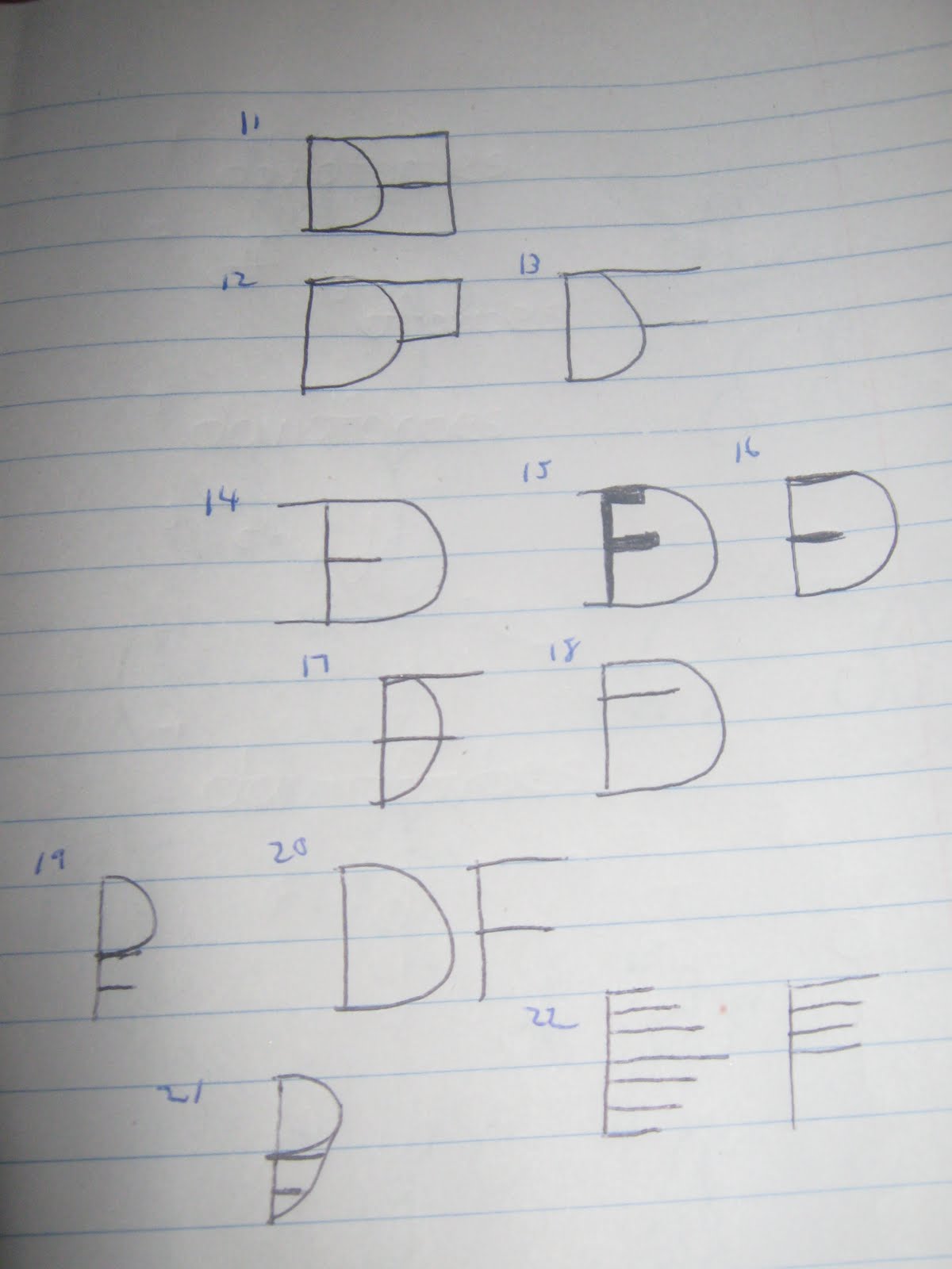
Over the years, I've developed an interest in designing my own personal logo. This has manifested itself through mostly sketches and doodles on notepads and Post-It notes during working and non-working hours. Inspiration has come in spurts, the largest of which took place today. Ultimately, I'd like to be able to slap a "DF" or "DJF" (can you guess my middle name?) logo on everything I do, whether it be a resume or this here website or whatever endeavor(s) I decide to take on down the road.
Below are over 200 logos I sketched out over a span of a few hours. Check 'em out and feel free to pick out your favorites!

I started out pretty basic, trying to keep a steady font. My favorites here are #2 and #4.

Creativity seemed to be lacking here. I like #15 a lot, though.

On this page, I experimented with mirror/inverse images. I like #28. It looks like a face with glasses on and one lens broken.

Here I was experimenting with ten-keys (number pads) and grids. I'm an accountant, so this makes sense! Hard to see the numbers here, but #40 at the top is my favorite. It seems to incorporate a plus sign in addition to a grid and a number sign. Not too shabby.

Continuing along with the number sign and grid inspiration. A little more bubbly. Nothing really sticks here, but I think one or two could use some sprucing up and look a lot better.

On this page I went back to messing with lowercase and uppercase, testing out all 3 of my initials. I sort of stumbled onto #74. Like it a lot. Also a fan of #72 and #76.

Here, I'm messing around with shadowing (primarily with the "F" in my name, as that's the only letter I can seem to figure out how to do) and combining two initials. Big fan of #83, #86, and #87.

Incorporating a dollar sign was a bit too difficult, so instead I turned to shading and negative space, a la the USA Network logo. Neat how some of this turned out. I like #99, #111, and #112.

Went back to some simpler designs here, as I started using sharper edges and a triangular "D". I like #130, #132, #133, #135, and #136.

Started thinking a little more outside of the box here. Some interesting designs, in my opinion. I like #143, #150, #152, and #154.

No doubt inspired by the Philadelphia Flyers here. We're in the heart of the Stanley Cup Finals, so what did you expect? Works out well with my initials in an inverted kind of way. I like #172, #173, and #175.

Clocks, targets, and bullseyes were the inspiration here. Got a little bubbly. Nothing too extraordinary, but I like #180 and #186.

#191 might be my overall favorite here. I used shadowing and the plus sign as my inspiration to come up with it. #188 was the precursor. I also used math symbols to come up with #195, #196 and #199.

Seems here I got my inspiration from the symbol of The Artist Formerly But More Recently Known As Prince and The Dan Patrick Show. I like #203 and #207. I used the T-account symbol for #211.
Let me know what you think! My next task is to get these designs onto Photoshop or Illustrator, clean them up a bit and add some color. Thanks for reading!
Below are over 200 logos I sketched out over a span of a few hours. Check 'em out and feel free to pick out your favorites!

I started out pretty basic, trying to keep a steady font. My favorites here are #2 and #4.

Creativity seemed to be lacking here. I like #15 a lot, though.

On this page, I experimented with mirror/inverse images. I like #28. It looks like a face with glasses on and one lens broken.

Here I was experimenting with ten-keys (number pads) and grids. I'm an accountant, so this makes sense! Hard to see the numbers here, but #40 at the top is my favorite. It seems to incorporate a plus sign in addition to a grid and a number sign. Not too shabby.

Continuing along with the number sign and grid inspiration. A little more bubbly. Nothing really sticks here, but I think one or two could use some sprucing up and look a lot better.

On this page I went back to messing with lowercase and uppercase, testing out all 3 of my initials. I sort of stumbled onto #74. Like it a lot. Also a fan of #72 and #76.

Here, I'm messing around with shadowing (primarily with the "F" in my name, as that's the only letter I can seem to figure out how to do) and combining two initials. Big fan of #83, #86, and #87.

Incorporating a dollar sign was a bit too difficult, so instead I turned to shading and negative space, a la the USA Network logo. Neat how some of this turned out. I like #99, #111, and #112.

Went back to some simpler designs here, as I started using sharper edges and a triangular "D". I like #130, #132, #133, #135, and #136.

Started thinking a little more outside of the box here. Some interesting designs, in my opinion. I like #143, #150, #152, and #154.

No doubt inspired by the Philadelphia Flyers here. We're in the heart of the Stanley Cup Finals, so what did you expect? Works out well with my initials in an inverted kind of way. I like #172, #173, and #175.

Clocks, targets, and bullseyes were the inspiration here. Got a little bubbly. Nothing too extraordinary, but I like #180 and #186.

#191 might be my overall favorite here. I used shadowing and the plus sign as my inspiration to come up with it. #188 was the precursor. I also used math symbols to come up with #195, #196 and #199.

Seems here I got my inspiration from the symbol of The Artist Formerly But More Recently Known As Prince and The Dan Patrick Show. I like #203 and #207. I used the T-account symbol for #211.
Let me know what you think! My next task is to get these designs onto Photoshop or Illustrator, clean them up a bit and add some color. Thanks for reading!
Subscribe to:
Posts (Atom)