Pages

Showing posts with label uniforms. Show all posts

Wednesday, August 18, 2010

Uni Thoughts

In no particular order:

- I was watching the Phillies-Giants game last night and thought to myself, "Why don't the Phillies wear their secondary patch on their uniforms like the Giants (and Orioles, as another example) do?" I think it would look pretty fly. As of now, they just wear their numbers on one sleeve, and I believe a patch for Robin Roberts on the other. Normally, that other sleeve would just be blank. Why not add this?


And on top of that, I wouldn't be opposed to seeing a new road uniform for the Phils. If "SAN FRANCISCO" can fit on a uniform, well, so can "PHILADELPHIA". Why not? Lack of Photoshop or Illustrator skills are keeping me from showing what I mean. Just think the Giants road unis in the Phillies colors with a Phillies patch and "Philadelphia" where all the Giants stuff is.

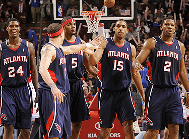
- I'm very happy that a few teams have changed their unis in the NBA. Happiest with the Utah Jazz and Cleveland Cavaliers. Other teams should take note - just because you have more jersey and short to work with, doesn't mean you need to fill it with crap. Talkin' to you, Clippers and Hawks, to name only a couple.

- With the NFL season fast approaching, I'm excited for a few things. The Eagles are busting out some beautiful throwbacks in week 1 against the Packers (and hopefully some other weeks as well). I was excited to see the Colts where those nice dark blue helmets against the 49ers in the preseason, but more baffled that we didn't see a home blue jersey to go along with it. I hope that changes. And those Packers are also wearing navy jerseys for a game or two this season. Should be fun to look at!

And I'd be remiss *again* not to mention my disgust and disdain for the current Cardinals, Vikings, Jaguars, Bills and Bengals unis. Seriously, guys. Seriously. It doesn't have to be this way! (Not even wasting my time putting up links for these monstrosities.)

Monday, July 26, 2010

Best NBA Home Uniform - My Turn!

A few days ago, BleacherReport.com put out their rankings of (what they thought were) the top home unis in the NBA. Well, I read the list, and, well, I disagreed with pretty much all of it. I'm not saying the person who wrote the list (Mr. Felkey, I'm lookin' at you, kid) has little clue of what he's talking about. I'm just sayin'.

So, I tried my hand at my own list. What I did was pretty frickin' awesome, if I may toot my own vuvuzela for a moment. I paired up each team against each other team, so as to have a complete 29-game round-robin schedule. No RPI and SOS discussions will ruin this masterpiece. What I came up with was quite different from Mr. Felkey's list. And, to be 100% honest and biased, it's a much more scientifically accurate ranking. It just is. I'm a uni guy - I know these things.

Before I begin, I will point out that I moved the Lakers and the Knicks from the 2nd and 15th spots, respectively, to where they are now after the round-robin (scroll down to find out, bucko). I just couldn't keep the Lakers up that high, as the longer I stared at their home unis (the yellow ones, not the actually more impressive white ones) the more I longed for the old-school versions. Also, the Knicks would have fared better with a better collar and the black-less uniforms from years past. But they still have uniforms worthy of the upper echelon in the NBA.

Also, I do have a weak stomach for piping and side panel messes. And I have an affinity for blue. Let's take those Rockets, for instance....enjoy....

30. Houston

When these came out, I was immediately turned off by the frailness of the design. It is a cool logo, but the sides of the jersey make it look like a blouse and there simply is no boldness to it. Had these been blue, they may have gotten a win or two in my round robin.

29. Washington

Take some Bullets and shoot these things, Gilbert. See what I did there?

28. Minnesota

Too much piping and cuteness here. I long for the original Wolves uniforms. The font kills it. Absolutely kills it.

27. Atlanta

Don't get me started on the Hawks' color scheme. Why are they red and blue??? The 3D lettering and piping is disgusting. Bring me back some Human Highlight Film uniforms!


26. Sacramento

They got too cute with this new uniform. It's generic and not so much fun to look at. Not a fan of the off-centered numerals on the front.

25. Utah

Can't wait for the new unis to come out. These are much better than the final years of Stockton and Malone, but they're not too much fun. Piping!!!

24. Milwaukee

What the Buck?!! I used to live in Milwaukee, so I can say that. The green and red are solid, but too shiny. The lettering needs to even out. I hate the big first and last letters. They're corny as hell, which is more appropriate for an Iowa or Nebraska team. Go back to the Moncrief days, please!

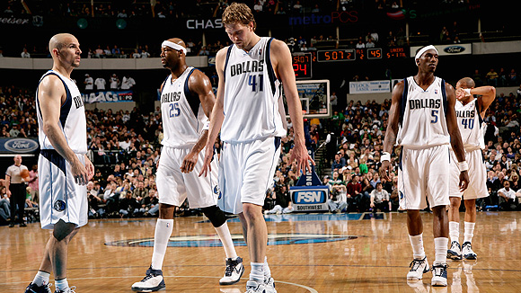
23. Dallas

Slightly better than their close relatives from Sac-town, probably cuz of the blue in there.

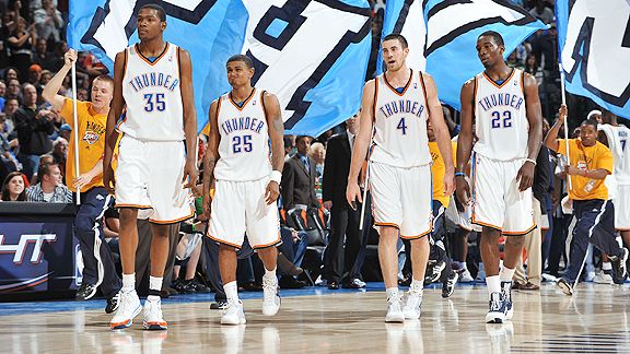
22. Oklahoma City

Big fan of the plain, old school style, but there's gotta be more to a uniform than this. The entire branding of this team baffles me. Still waiting for the overhaul. Will there be one soon?

21. Phoenix

Sides are too thick. And that floating circle irritates me more and more. Why not just get rid of it? That would be an instant hike 5 spots in these rankings.

20. Detroit

Might be the first big surprise of these rankings. The Pistons had sweeter unis in the 80s, and for some reason they think they've improved on those. The font is bland and weak. It's really a blah uniform.

19. Toronto

It's a sleek design, but it's missing something. Perhaps history, I don't know. I do know the color scheme isn't helping.

18. New Jersey Nets

They could stand to get new jerseys. Get it? I'm on fire, really. "NETS" is too big, but the color scheme gets them to this level of mediocrity from that of the Kings and Mavs.

17. Denver

Felkey loves these. I say the shine is their demise. Powder blue is a great color, but the design is weak. Less would be more in this case. Let the powder blue carry you, is what I always say. Heck, if they went with that shade at home and navy on the road, I'd be in sky blue heaven.

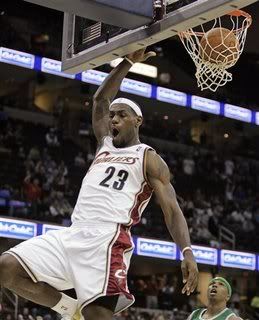
16. Cleveland

Love the template. The wine and gold is played out again. Those "CAVS" alts really should make a comeback. My Decision is final here.

15. Orlando

I like what the Magic have done here, with the bold "Magic" on their chest. The piping and striping still take away from what could be a much better design.

14. Philadelphia 76ers

Oh. So. Close. All the Sixers had to do was completely go back to their 80s design and not continue to tease us. The different colored letters and numbers flat out piss me off. Not to mention whatever weirdness they decided to cloud the sides with. Ugh.

13. Miami

Quite frankly, this is a great design. Bron-Bron will look good in this uniform. It's just missing something to vault it into the top 10. Perhaps it's the color scheme I don't love.

12. Memphis

I immediately think Stanford when I see these. I think this is one of the best color schemes in sports. Also see: L.A. Galaxy. But just as I didn't think Stanford fully grabbed me with their font, so don't these.

11. New Orleans

Number 1? Hardly. If anything, the pinstripes take away from it. "New Orleans" is a pretty busy name to have on your chest as it is. Great colors for a great city that I've never been to. Just a little too busy for my liking.

10. Portland

I'll complain about the upper-case "BLAZERS" all night long. All night. All night long. All night. The font is weak. This could be a top-5.

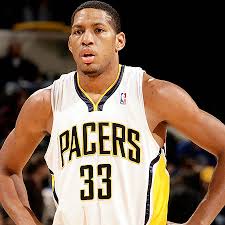
9. Indiana

Reminiscent of the Magic uniforms, but done a little better, in my opinion. You could argue these are underrated. But I won't, cuz it might inspire some schmuck to make his own list.

8. New York Knicks

The black trim kills these unis. Why, why, why? And the collar. What's up with that? Another great uniform gone wrong, but still a top-10 one.

7. Los Angeles Lakers

Great uniforms. Crisp. Bright. Nice cut. I like how they updated them, but the numbers get to me. And as mentioned above, I prefer the white ones. Those are really neat-o.

6. San Antonio Spurs

This is a classic uniform that hasn't been tarnished for the most part. And you can't even say the addition of black has ruined them. Ha! The color scheme works with this blue-collar team, although not one of my all-time faves. Still, the design is awesome and it's a template I wish more teams would use. Talkin' to you, Houston and Minnesota.

5. Golden State Warriors

Now, I'm going out on a slight limb here (a twig?) to say these unis will mostly resemble "The City" uniform from the past. Judging from the jersey, it looks like they will. And those things are beautiful.

4. Los Angeles Clippers

I'm proud of this team for grinding through years of suckitude to make it to the top 5 of these here rankings. Way to hang in there, fellas. Quite frankly, these are great uniforms. I'd tweak the thick side stripes a little thinner. Do that and these contend for the title. The cursive "Clippers". Need I say more?

3. Charlotte Bobcats

In what could be the most surprising in these rankings, the Bobcats have landed in the top 5. Why? The color scheme is wonderful. The crispness of the uniform on the whole. The pinstripes work for these guys. It's not over the top, while pushing the envelope a little bit. It passes the eye test for me with flying colors.

2. Boston Celtics

A true classic. The Lakers and Sixers could have followed suit 100% and been up here with them. These have stood the test of time. Nuff said.

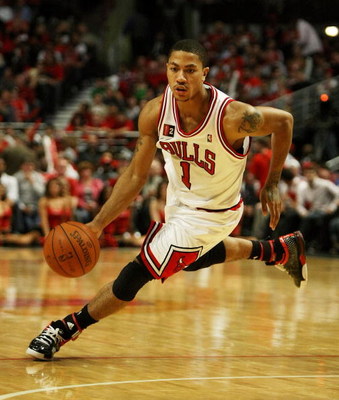
1. Chicago Bulls

What we have here is a work of art. The trim, font, shorts design. It's all here. You simply can't mess these up. Too bad Lebron isn't going to be wearing these. Although an even better player once did. How did that look to you? (Image courtesy of Bleacher Report, ironically enough.)

What are the biggest discrepancies between the two lists, you ask? The Warriors, Pacers, and Sixers jumped up 17, 12, and 10 spots, respectively, in my list. The biggest losers were Dallas (13 spots), Denver (13), Houston (14), and Milwaukee (15). Sorry, guys. Your work is cut out for you.

Comments welcome. Vote in the poll to the right on who has the better list, if you dare! As always, thanks for reading.

Tuesday, January 12, 2010

Uni Tourney Final - SMU vs. UCLA

It's the granddaddy of 'em all. Well, sort of. Not really.

SMU vs. UCLA. The Mustangs vs. the Bruins. Interestingly enough, both teams in their away uniforms. I think that's an ode to the strength of their sets.

First up, SMU.


Truly a beautiful uniform from head to toe. You can't help but think of the Bills when you look at these. It's practically the same uniform. I'm not even sure who donned it first. I know SMU returned to these after some monstrosities earlier in the decade. This is what a uniform should look like.


Personally, I could do without the "SMU" on the chest, but that's just me. I love the striping all the way through. Big fan of red and blue.

Now, UCLA.


The jersey might get the nod over SMU. I'm a sucker for blue. And two shades of it is just awesome (see Tennessee Titans). The helmet is simple. Could use a stripe or two, but again, that might be picky. The pants, too.

Back to the jersey, though. I'd wear this. I really would.


Tough call, but when going head to toe, SMU's uniform is close to perfection. I really don't know why schools go Mickey Mouse on us. Teams like Michigan (away piping), Georgia Tech (ridiculous stripe across the chest for no reason), and the Under Armour schools (Texas Tech, South Carolina, etc) with their completely overblown and silly looking unis. It's out of hand. With all the improvements in uniform technology, you can still go with a classic uniform. It's a sad state of affairs, really.

SMU takes the crown. It was almost a foregone conclusion! The lesson to be learned here is that simple is better. Dance with the girl that brung ya, or whatever the saying is. You wanna sell jerseys? Run the "Would I wear this?" test. These finalists get it.

WINNER: SMU

Uni Tourney Final Four!

Quick summary of how this has played out:

Round of 32:
Fresno St. vs. Alabama
UCF vs. Iowa
MTSU vs. TCU
BYU vs. Michigan State
Cal vs. Ole Miss
SMU vs. South Carolina
Ohio vs. South Florida
Pitt vs. Florida
USC vs. Ohio St.
Clemson vs. LSU
Texas A&M vs. Florida State
UCLA vs. Auburn
Wisconsin vs. Tennessee
Idaho vs. Iowa St.
Nebraska vs. Navy
Air Force vs. Oklahoma

Sweet Sixteen:
Alabama vs. Iowa
MTSU vs. BYU
Ole Miss vs. SMU
South Florida vs. Florida
USC vs. LSU
Texas A&M vs. UCLA
Wisconsin vs. Iowa St.
Navy vs. Oklahoma

Elite Eight:
Alabama vs. BYU
SMU vs. South Florida
LSU vs. UCLA
Wisconsin vs. Navy


Here goes:

Semifinal #1
BYU vs. SMU


Just take a second to admire that beauty. Ok, ok. BYU sports a two color look. Kudos for escaping that old two-color look from a few years back that had everyone confused and returning to a uni from the days of Ty Detmer and Steve Young. These are things to behold.

Meanwhile, SMU's look just continues to excite. Honestly, BYU looks extremely solid, but SMU's set is like candy. Candy! And who doesn't like candy?!?!

Finalist: SMU

Semifinal #2
Navy vs. UCLA


Golden domers here. And I ain't talking Notre Dame. Too bad, because they could have made a run in this. Anyways, let's start with UCLA's beauty of a jersey. Two shades of blue work here. Great stripe treatment. Helmets are a notch above Navy's, because, well, there's a word on there.

Navy has come this far on shock value. They busted these out against Army and wore them again against Mizzou. I like 'em, but I have to employ the "Would I wear the jersey?" test and I know I wouldn't - not just because Dad would disown me.

Finalist: UCLA

Bowl Season Uni Tourney - Elite Eight

Who's pumped? Personally, I'm geeked.

Alabama vs. BYU

It's funny - I had BYU go far in my college basketball uni tourney a year or so ago. Someone knows what's up out in Utah!


This is where Alabama's run ends. The tide has a great uni, but you can't deny BYU's great look.


Final Four bound: BYU

SMU vs. South Florida

South Florida has surprised with the change to the white helmet, representing other schools that saw a ghost like Arizona and Cincy. Unfortunately, I can't deny the beauty of SMU's set here. The 'Stangs are just better looking. Wanna improve, South Florida? Bust out some pants stripes next year and keep the white helmet.


Final Four bound: SMU

LSU vs. UCLA


UCLA has some great jerseys, and they win that department. LSU takes the pants department. Helmets? Close one. I initially thought LSU should take this, but I can't deny my affinity for those Bruins jerseys.

Final Four bound: UCLA

Wisconsin vs. Navy

You can tell I like stripe patterns. Well, I don't think I'm making it 4 for 4. Wisconsin impresses, but to get really picky, I didn't like the "W" they stuck on the back of the jersey. Maybe I'm looking for an excuse to go against my Badger friends. Or, I'm just not done with Navy.


Final Four bound: Navy

BYU-SMU. UCLA-Navy.

Once again, I ask - who's pumped????

Bowl Season Uni Tourney - Sweet 16 (cont.)

Let's finish up the Sweet Sixteen....

USC vs. LSU

Another great matchup on the field. Another tough one in the uniform category...


Battle of the yellow pants. For me, this boils down to which uni is just more fun to look at. And, honestly, the same way the USC era is over with Pete Carroll gone, it's over for USC in this matchup. LSU moves on.

Winner: LSU

Texas A&M vs. UCLA


I might be a sucker for blue, but I just enjoy those UCLA jerseys a little bit more than the Aggies ones. UCLA should add a pants stripe, but their jerseys carry them through. A&M would win most other matchups for sure.

Winner: UCLA

Wisconsin vs. Iowa St.

Ya know, ISU hasn't totally ripped off USC. They took the two stripe motif (yeah, I said motif) and carried it out in every element. Well, Wisconsin does a similar thing, but has more of a pop to theirs.


And Wisconsin's helmets are far and beyond better.

Winner: Wisconsin

Navy vs. Oklahoma

Navy did themselves a favor by going with the alternates, including the nod to the Marines. And, even though they sport the bib - which I normally despise - these unis are pretty badass. Oklahoma has a nice set, but I think the Academy moves on.


Winner: Navy

And we're now down to the Elite Eight of College Unis. Here are the pairings:

Alabama vs. BYU
SMU vs. South Florida
LSU vs. UCLA
Wisconsin vs. Navy

Bowl Season Uni Tourney - Sweet 16

First 4 matchups of the Sweet 16....

Alabama vs. Iowa

The Tide rolls in with some basic, yet classic, unis. They keep it simple. Meanwhile, Iowa rolls in with a more detailed style, but classic nonetheless.


Breaking this down, I'd say they tie in the helmet department. Bama gets the slight edge in the jersey department, especially if I do the ol' "Which jersey would I want to wear?" test. And quite frankly, the thick black stripe on the pants gets to me. Bama wins a close one, unlike the national championship game.

Winner: Alabama

MTSU vs. BYU

This isn't much of a contest. MTSU got by some easy matchups with Southern Miss and TCU. Here BYU's classic style just blows them out of the water. See ya, Cinderella.


Winner: BYU

Ole Miss vs. SMU

Here's where I get to rip on Ole Miss. They have a case of the NY Giants - perhaps this has to do with Eli. Let me explain. There's no link between jersey and pants. And helmet and jersey. On their own, they all represent pretty sweet uniform elements. Together, not so much. (The same thing is happening with the NY Giants - especially their road unis.)

Meanwhile, SMU just continues to impress.


Winner: SMU

South Florida vs. Florida

Finally, these teams square off! South Florida went white helmet and it got me all giddy. It continues to. Florida, on the other hand, comes in with a classic set. But I'm left to yearn for that white helmet they wore against FSU and again in the SEC Championship game. It showed me what levels they could reach in uniform stardom. Damn, it's tough to go against the Gators here. Looks like I just did.


Winner: South Florida

Next 4 Sweet 16 matchups in a little bit...

Monday, January 11, 2010

2009-2010 Bowl Season Uni Tourney (cont.)

Last 4 matchups...

Wisconsin vs. Tennessee


Tough one, with both teams having the same style. But hand it to Wisconsin for a bolder and better look, in my opinion. Or, maybe it's just cuz I lived there. Ha!

Winner: Wisconsin

Idaho vs. Iowa St.


Kudos to Idaho for changing up to a better look this season (and for getting this far in ANY tourney), but Iowa St. advances with those USC ripoffs. We'll see how long they can ride those coattails.

Winner: Iowa St.

Nebraska vs. Navy


Call me a patriot, but I just have to give Navy the nod here. Especially since this is an alternate uni that gives the Marines a nod with the inclusion of the red stripes. Nebraska has that classic look, but Navy's just look better.

Winner: Navy

Air Force vs. Oklahoma


And this is where the patriotism ends!!! So long Air Force - you're piping ruins it for you. Shoulda kept it simple. Oklahoma advances.

Winner: Oklahoma

Now onto the Sweet Sixteen - here are the matchups:

Alabama vs. Iowa
MTSU vs. BYU
Ole Miss vs. SMU
South Florida vs. Florida
USC vs. LSU
Texas A&M vs. UCLA
Wisconsin vs. Iowa St.
Navy vs. Oklahoma

Stay tuned!!!

2009-2010 Bowl Season Uni Tourney (cont.)

USC vs. Ohio St.


Classic matchup on the field, with USC owning the Buckeyes over the years. Also a classic uni matchup. What separates the two is the change the Buckeyes made a few years back to alter their unis. I didn't like the change. USC moves on.

Winner: USC

Clemson vs. LSU


Battle of the Tigers. Here, the Bayou Bengals advance because Clemson's piping comes into play.

Winner: LSU

Texas A&M vs. Florida State


The uni experts might not agree, but I am not a fan of FSU's collar action. Too fancy. I like what the Aggies have done with their look. Bobby Bowden and the Noles bow out here.

Winner: Texas A&M

UCLA vs. Auburn


Auburn would have had a shot without that big ass UA symbol. Still, UCLA just has that majestic look that can't be denied.

Winner: UCLA

Last 4 matchups of the first round coming right up...

2009-2010 Bowl Season Uni Tourney (cont.)

Cal vs. Ole Miss


This is where Cal's run ends. Ole Miss just has that classic uni, although we'll see how long they last with their inconsistent set.

Winner: Ole Miss

SMU vs. South Carolina


This could be the best helmet battle of the whole tourney, but the rest of the uniform must come into play here. And I've mentioned my hatred for Under Armour. This is where SC's run ends. SMU has one of the sweetest unis in all of college. They could make a run to the end.

Winner: SMU

Ohio vs. South Florida


This is a tough one. It's hard to really determine by the pics. Ohio has a standard classic uni. South Florida has a more modern one, and the switch to the white helmet tells me they're really trying. One thing I can't get over is Ohio's boring helmet word mark. USF wins the helmet battle. Something just says "stiff" to me when watching Ohio. In a photo finish, I'm pushing South Florida through.

Winner: South Florida

Pitt vs. Florida


Another close matchup. Pitt made a change this year and it looks great. Florida threw in some Pro Combat this year, but in this game, they went with their standard uni. I'm not too crazy about Pitt's helmet, and would like to see them return to the old cursive of the Marino days. Florida just looks a little more diesel. Maybe it's the Tebow influence? Another one for the Florida schools.

Winner: Florida

Halfway through this round. Stay tuned for the next 4 matchups...