Below are over 200 logos I sketched out over a span of a few hours. Check 'em out and feel free to pick out your favorites!

I started out pretty basic, trying to keep a steady font. My favorites here are #2 and #4.
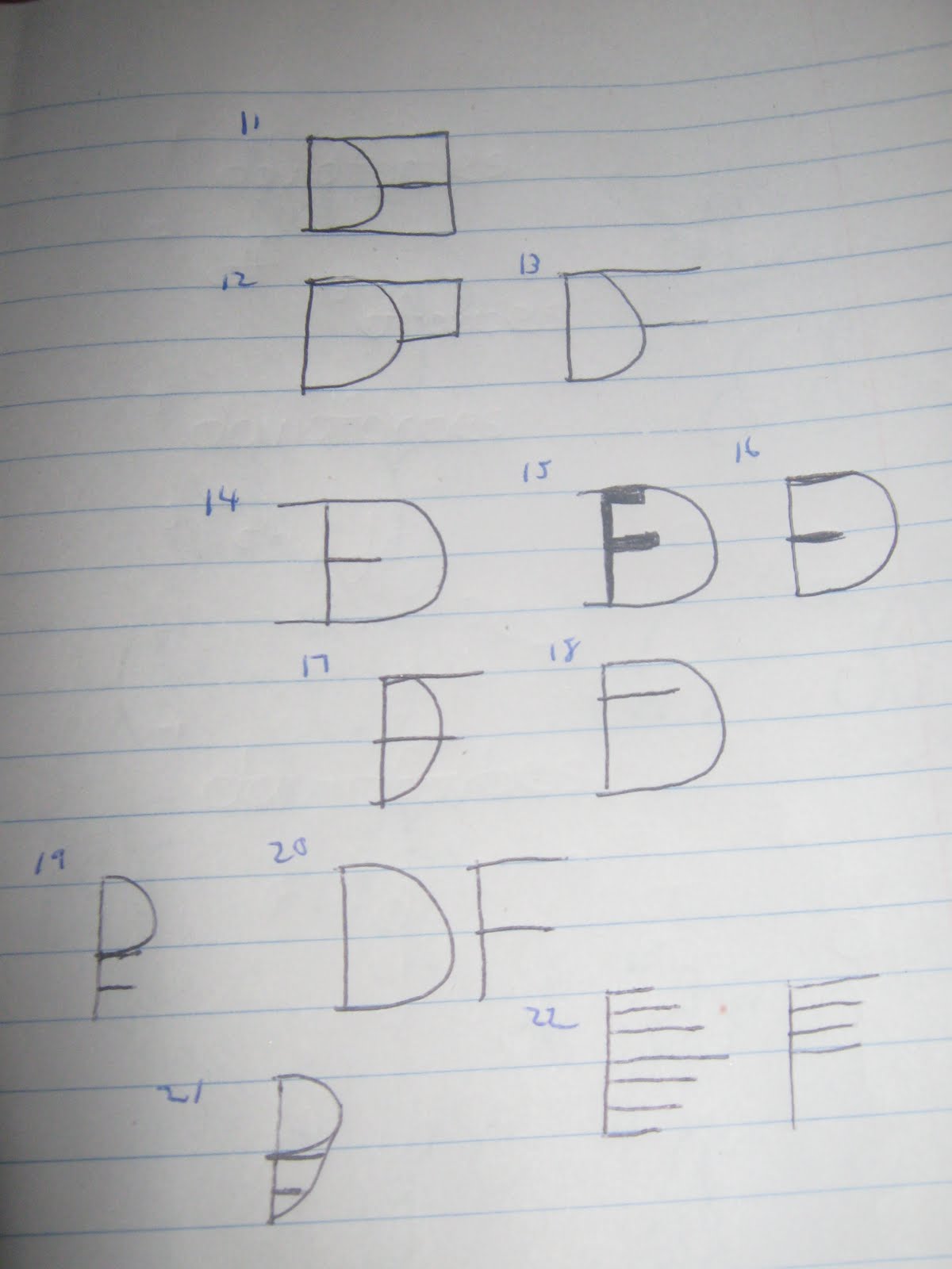
Creativity seemed to be lacking here. I like #15 a lot, though.

On this page, I experimented with mirror/inverse images. I like #28. It looks like a face with glasses on and one lens broken.

Here I was experimenting with ten-keys (number pads) and grids. I'm an accountant, so this makes sense! Hard to see the numbers here, but #40 at the top is my favorite. It seems to incorporate a plus sign in addition to a grid and a number sign. Not too shabby.

Continuing along with the number sign and grid inspiration. A little more bubbly. Nothing really sticks here, but I think one or two could use some sprucing up and look a lot better.

On this page I went back to messing with lowercase and uppercase, testing out all 3 of my initials. I sort of stumbled onto #74. Like it a lot. Also a fan of #72 and #76.

Here, I'm messing around with shadowing (primarily with the "F" in my name, as that's the only letter I can seem to figure out how to do) and combining two initials. Big fan of #83, #86, and #87.

Incorporating a dollar sign was a bit too difficult, so instead I turned to shading and negative space, a la the USA Network logo. Neat how some of this turned out. I like #99, #111, and #112.

Went back to some simpler designs here, as I started using sharper edges and a triangular "D". I like #130, #132, #133, #135, and #136.

Started thinking a little more outside of the box here. Some interesting designs, in my opinion. I like #143, #150, #152, and #154.

No doubt inspired by the Philadelphia Flyers here. We're in the heart of the Stanley Cup Finals, so what did you expect? Works out well with my initials in an inverted kind of way. I like #172, #173, and #175.

Clocks, targets, and bullseyes were the inspiration here. Got a little bubbly. Nothing too extraordinary, but I like #180 and #186.

#191 might be my overall favorite here. I used shadowing and the plus sign as my inspiration to come up with it. #188 was the precursor. I also used math symbols to come up with #195, #196 and #199.

Seems here I got my inspiration from the symbol of The Artist Formerly But More Recently Known As Prince and The Dan Patrick Show. I like #203 and #207. I used the T-account symbol for #211.
Let me know what you think! My next task is to get these designs onto Photoshop or Illustrator, clean them up a bit and add some color. Thanks for reading!
2 comments:
Your sleep schedule is wacky. I like
46
96
and 183
I like 191
The ones that look like the Flyers logo would get you into trouble with the NHL
Post a Comment